Pulse App
A solution for the CEO to have an understanding in near-realtime of what the "pulse" of the operations was.

PROJECT OVERVIEW

The product:
The CEO wanted to have an understanding in near-realtime of what the "pulse" of the operations was. To provide a daily snapshot of the health of a contract. His leadership team developed a set of questions that would provide an overall score of a contract to determine if additional focus was needed to help improve operations. Operations managers and contracts are required to answer and submit a submission in Pulse app on a daily basis.
The problem:
Users need an alternative to having to download the mobile app in order to use the application. Ideally, this application could live within Microsoft Teams where they could access from the web, their Teams desktop app, or Teams mobile app to reach all form factors.
The goal:
Users can answer and submit a submission from Teams/desktop/mobile app on a daily basis
Responsibilities:
Conducting interviews, paper and digital wireframing, low and high-fidelity prototyping, conducting usability studies, accounting for accessibility, and iterating on designs
UNDERSTANDING THE USER
User research: summary
I conducted interviews and created empathy maps to understand the users I’m designing for and needs. A primary user group is operations managers. Each station (typically an airport) is made up of multiple contracts. A contract is a service that we offer to a specific customer at a given station. For example in Atlanta we have Delta Wheelchair, Delta Cabin Cleaning, and Delta Full Handling. There are sometimes where an entire airport, no matter number of contracts, is managed by a single manager. There are also cases where there are managers per contract or airline customer. The primary manager can delegate his/her staff to use the app to complete these submissions as well.
This user group is expected to complete the submission at the end of the day or the following morning for the assigned contracts.
User research: pain points
1
Time
Users are required to submit daily.
2
Platform
This app could live within Microsoft Teams where users could access from the web, their Teams desktop app or Teams mobile app to reach all form factors.
3
Switch account
It is possible for a user to have multiple contracts.
Persona
.png)
Problem statement:
Justin is a station manager of operations who needs easy way to manage different contracts because he has one wheelchair agent, one cabin agent, one aircraft load agent, and one wheelchair agent on his team.
STARTING THE DESIGN
User Flow

As the initial design phase continued, I made sure to base screen designs on feedback and findings from the user research.

Paper wireframes
Taking the time to draft iterations of each screen of the app on paper ensured that the elements that made it to digital wireframes would be well-suited to address user pain points. For the home screen, I prioritized a quick and easy open a submission process to help users save time.

Star were used to mark the elements of each sketch what would be used in the initial digital wireframes. This paper wireframes follows the template of the Microsoft Teams personal app.
Digital wireframes
Low-fidelity prototype (Mobile)
The Low-fidelity prototype connected the primary user flow of filling out and submitting a submission, so the prototype could be used in a usability study with users.

Low-fidelity prototype (Desktop)

User journey map
Mapping Justin’s user journey revealed how helpful it would be for users to have access to Pulse app.

Usability study: findings
These were the main findings uncovered by the usability study:
1
Adding skip feature
For some users who only operates three days per week to skip submission on those days not operating
2
Change notification way
The email notification can be overwhelming and fill up users inbox.
REFINING THE DESIGN
Early designs doesn’t allowed for user to skip the submission on submission detail page, but after the usability studies, I added a skip submission option. So users have the option to skip the submission when they on any days not operating

Mockups
High-fidelity Prototype (Mobile)

High-fidelity Prototype (Mobile)
The final high-fidelity prototype presented cleaner user flows for fill out submission and submit.
High-fidelity Prototype (Desktop)

High-fidelity Prototype (Mobile)
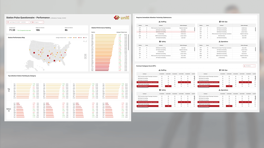
High-fidelity Dashboard (Power BI)
Design assets
.png)
Accessibility considerations
Used of color
Don’t specify important information by color alone. Use a combination of text, color or graphical objects.
1
2
Consistent navigation
Ensure that repeated components occur in the same order on each page of a site.

GOING FORWARD

Impact:
The app makes users feel like Pulse really thinks about how to meet their daily work needs.
One quote from a station manager feedback:
“This app makes everyday’s airport operations faster and easier.”

What I learned:
While designing the Pulse app, I have a deep understanding of design rules of Microsoft Teams personal app.
This is my first project at Unifi. In the cooperation with different departments, understand the work process of Unifi. And usability studies and peer feedback influenced each iteration of the app’s designs.